The Rivermark community has a true town center...one of the few that I have seen in new urbanist communities that is pulled off almost flawlessly. This town center has it all, a grocery store, in line retail, stand alone restaurants, fast food, and a hotel. Again, this is a very well thought out town center. The architecture was superb (and it blended with the residential), the pedestrain plazas were well executed, and the parking lots were broken up into smaller segments, making it visually appealing, and pedestrian friendly.
 One of the big things that I was really impressed with, was how well the commercial architecture was integrated with the residential community. Take for example, the rear of the Albertsons grocery store. Very careful attention was paid to the massing of the building. What is normally a blank facade was broken up by varying the depth of the building, raising and lowering the parapet of the building, and most importantly, just varying the color of the walls. Another thing they did was screen the service areas, using the walls to blend those areas with the buildings. In addition, there was landscaping which further softened the buildings. A big thing to point out, is that this was all done with minimal setbacks from the ROW, and not wasting land with unuseable turfgrass.
 As I mentioned before, the pedestrian areas were very well thought out. They didn't spend a lot of money on fancy paving patterns, materials, or colors. Instead they chose to keep it simple, using a simple diaganol scoring pattern with standard concrete. What they did do though, was actually allow ample room for merchants to display there wares, have some outdoor seating, and allow pedestrians to walk. It wasn't cramped like a lot of storefronts are. They also integrated planting areas, street trees, simple seating, light poles and banners in one integrated area. This makes the whole center flow together.
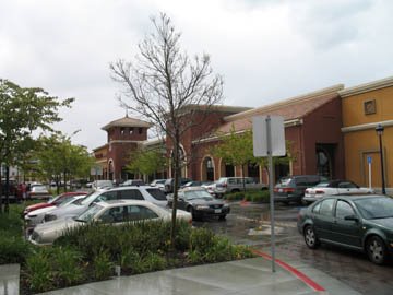 Finally I want to talk about the parking. I was very impressed with how they were able to break up what are usually massive parking lots into smaller blocks, and well landscaped. This pictures shows the entrance and parking right in front of the Albertsons store...and they actually had head in parking right in front of the store. I like this because it gives people a chance to walk out of the store and collect themselves without being thrown right into the traffic lane. (The target store where I live is the worst...the doors are all of 6 feet from the traffic lane...but I digress). They were actually able to pull off a true village streetscape. But, the parking also brought up my only gripe with the whole project...there wasn't enough of it. We decided to have lunch here at the Red Robin restaurant, dropped off my wonderful wife to hold a table, and then the kids and I drove around all the parking lots about 5 times, and never did find a place to park. We wound up having to park about 5 blocks away in front of residential homes. It wasn't all that bad, since it was a pleasant walk. I am also all in favor of reducing parking, as I believe that most places are overparked. But this took it to the other extreme. In all fairness though, I have only been here once, at lunchtime. And the commercial area happens to be accross the street from a major Sun campus. So, I have no idea if the parking shortage was an extreme case, or if it happens on a regular basis.
There you have it. My thoughts on one of the best communities and examples of new urbanism that I have found to date. I hope you enjoyed it!


No comments:
Post a Comment