What first caught my eye on this project was the entry monument...and the commercial area! We were driving down the main street going past the community, heading off to meet some friends for dinner, when we went by, and my attention was immediately drawn to the commercial area. It was lively! It had color! It had interesting architecture! And there wasn't a huge sea of parking in front of the stores...they were brought to the street!
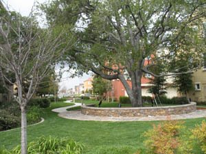
Beyond that though, the whole community works together. There is unity in the overall design, the landscaping, colors, street furniture, and sight line vistas. There were 3 national builders of the residential component, with five total product lines. But all the home architecture, while varied, all read as a comprehensive whole. There are common elements throughout the community, most noticeably, the stone that was used in the landscaping, on the mailbox structures, and even some of the courtyard walls...it was all the same. The stone was even used within the commercial area, and on the entry monuments...all helping to pull the architecture together. Look at the picture I used in my overview blog of Rivermark, and you will see what I mean.
The site plan was very well thought out. There are several pocket parks, one for each general sub neighborhood, as well as a central community park. The varied product lines are integrated together. Sometimes product lines changed at the street with townhomes on one side of the street, and single family on the other. Sometimes it changed at alleys, and sometimes it changed across a connecting pedestrian way.
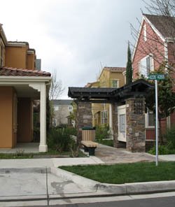
One key unifying element in the residential area were the mailboxes. These were actually designed to be a small gathering place with a trellis, usually benches were included, and always integrated into a pedestrian pathway or node. Forget the standard gray post office structure...make it an amenity.
The landscaping of this community was outstanding. Visually unappealing areas, such as alleys, were screened from pedestrian ways with vegetation. Shrub roses and perennials were used extensively. Turf grass was used sparingly, usually in bigger common areas. This created the illusion of a lush landscape that is actually very water thrifty...something we need to start doing in Colorado. The landscaping also helps to mask the density of this community. This is how you make high density work. Granted, this is California. They have the luxury of having plant material that will be green all year long...beyond Junipers. They also have a much bigger canvas of plant material to pick from that we do, but we can certainly borrow the ideas, and with the development of smaller and smarter plant material, we will be able to do the same thing.

Finally, this is a very pedestrian friendly community....without going into overkill mode. All street sidewalks were detached with parkway strips and street trees. Most people who know me know that I am a huge fan of detached sidewalks. I live in a community that has them, and I swear by them. The parkway strip creates just enough of a visual barrier, that the kids stay out of the streets! There are strong pedestrian connections uniting the primary park to the residential areas, and to the commercial area. I have included a picture looking down the street from a block of townhomes looking towards the commercial area. All the pedestrian connections tie together and to the street logically. But the didn't get carried away. Within the commercial area, there weren't any diagonal connections across the parking lot. You either followed the walks in front of the stores, or you walked through the parking lot. However, the parking lots themselves were fairly small by Colorado standards. I seriously doubt they had 5 spaces per 1,000 square feet of commercial...but then, that will be covered later.
This should help paint the overall picture of Rivermark. Next time I will talk about the residential component in more detail.